Designing A Landscape With Contrasting Materials
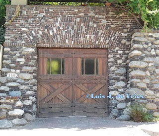
 The idiosyncratic combination of bricks with arroyo stone that became a hallmark of Greene and Greene landscape design is one example of how to use contrast to create drama or emphasis in the garden. The two materials couldn't be more different: The dark-colored bricks are uniform in size and shape, while the nearly-white stones and boulders exhibit a variety of rounded shapes and sizes.
The technique can be used horizontally, as shown in the close-up of the walkway around the ponds in the rear terrace of the Gambel House, or vertically, as seen in the construction of a garage on a neighboring street. The elaborate wooden garage doors add yet a third contrasting element.
The walkway inserts an element of surprise, in that we expect brick pathways to have linear boundaries contained by a soldier course of brick on either side. In the case of the Gambel terrace, not only is the edging made of a completely different material, but the bricks in the perimeter of the walkway are also staggered, creating an irregular boundary of their own.
There are many ways to use contrasting materials in the garden, for example: Stucco and timber; wood chips, grass, or creeping plants with flagstone; stone and wood rail fences with climbing roses, clematis, or other vines; brightly colored pottery against a green hedge or contrasting color adobe wall; a concrete ornament against a brick background.
What's your favorite way to use contrasting materials to perk up the garden?


